The Best-Looking Basketball Courts of the Big East (Ranked from Worst to Best)
via Twitter @bigeast
I decided to begin a quest to determine which college basketball teams around the country have the best-looking courts. But first I’m going to break down each of the biggest conferences in college basketball before putting together a Top-10 “Best-Looking Courts in America” list. I have already done the PAC-12, so now from worst to first, I am ranking each court in the Big East based on how “cool” their court is.
**Important**
These lists are determined ONLY on how cool I think the court design looks. I am NOT taking into consideration how historic and traditional certain teams and courts are, which would give the blue bloods an unfair advantage. I’m pretending I know nothing about each team and their history. Let’s get started.
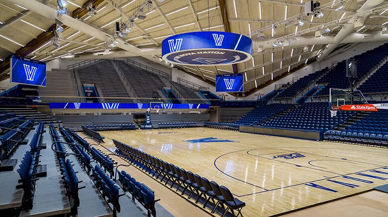
10. Villanova Wildcats
1.villanova.edu
This is a new arena, and while I’m sure it’s extremely nice, the court design leaves much to be desired. To me, it looks like they were in the middle of painting the court and decided it was lunchtime and just never came back to finish it. I know that’s the simple look that Villanova, as well as other traditional schools in the Big East want, but setting tradition aside, this one just doesn’t do it for me. Some simple designs do, but not this one.
9. Creighton Bluejays
gocreighton.com
The problem with their court is not the design, but the color scheme. It’s very bland. Deep blue and black just doesn’t look that great together. I think their logo at mid-court is pretty cool-looking, but the color scheme takes away from it tremendously.
8. Georgetown Hoyas
vividseats.com
This is such a classic and traditional school, so it’s a shame for them that I’m throwing those things aside making these lists. Tradition considered, it’s a great court because what they’re saying is, “this is who we are, who we’ve always been, and who we’ll always be.” But for this list, it’s too simple and plain. The G at midcourt is plain-looking, so nothing really on this court stands out.
7. Xavier Musketeers
goxavier.com
This court is very similar to Georgetown’s with basically the same color scheme and a simple letter at mid-court. The reason that I put it ahead of Georgetown because of their giant X at mid-court. I can’t think of any other basketball courts that feature an X as their midcourt logo, and since it’s a unique letter, it makes this court unique. And unique is cool.
6. DePaul Blue Demons
depaul.edu
This court has potential, but it just doesn’t reach it. I love the Chicago skyline featured at the bottom of the court. It’s very unique and pays tribute to their city. But other than that, I don’t like this court very much. I’ve never liked the light-colored hardwood too much and their school’s logo just doesn’t do it for me. The color scheme isn’t great and there’s just too much going on with it. The skyline definitely bumped this court up several spots.
5. Seton Hall Pirates
shupirates.com
The Pirate logo is pretty awesome, so to have it as the main focal point at mid-court helps this court a lot. Other than that, there’s not much going on with it since they are keeping a classic look, but the pirate logo is so cool that it takes the 5th spot here.
4. Providence Friars
friars.com
I like several things about this court. The two-toned wood, the black and white colors, and the Friar logo are all awesome. Black and white are always tough-looking colors for sports teams. And I’ve always thought their logo is cool and very unique. It’s a fairly simple, but tough-looking court.
3. Marquette Golden Eagles
gomarquette.com
This court really looks good and it starts with the Marquette blue and yellow. Those colors look great together and the way they used them on this court makes the court really “pop.” The MU at mid-court looks good and the MARQUETTE along the baseline really stands out. I also love the two-toned wood they use to separate the paint area from the rest of the court. Just a sharp-looking court.
2. St. John’s Red Storm
redstormsports.com
I didn’t know how much I liked this court until I really looked at it. The coolest thing about this court is the throwback look. It’s a very old gymnasium to begin with, and their court design looks the part. The color of the wood looks classic, along with the logo at mid-court. I love the Lou Carnesecca signature on the court, paying homage to their longtime coach. I also love the “We Are New York’s Team” written along each baseline. What a statement to make. This would be an awesome place to play your home games at.
1. Butler Bulldogs
butlersports.com
Like I said earlier, some simple designs do it for me and other don’t. This one does. However, not everything is simple about it. I don’t consider the Bulldog logo at mid-court to be simple, but it’s very awesome and is what shoots this court up to the top spot. The colors are simple, but still look good, just like BUTLER along both baselines printed in standard lettering. Another thing that is really cool is the “Hinkle Fieldhouse” along the sideline. Any basketball court named “fieldhouse” is automatically cool, so to have that printed on their court is awesome. This is just an awesome-looking court.
Garett


